-
Design a custom responsive website based on UX & UI research within three weeks.
-
Attract new partners looking for a qualified and experienced coach for an organization.
-
Clear and easy understanding of the product and service offerings and an easy, uncomplicated way to connect with coaches for more information or consultation.
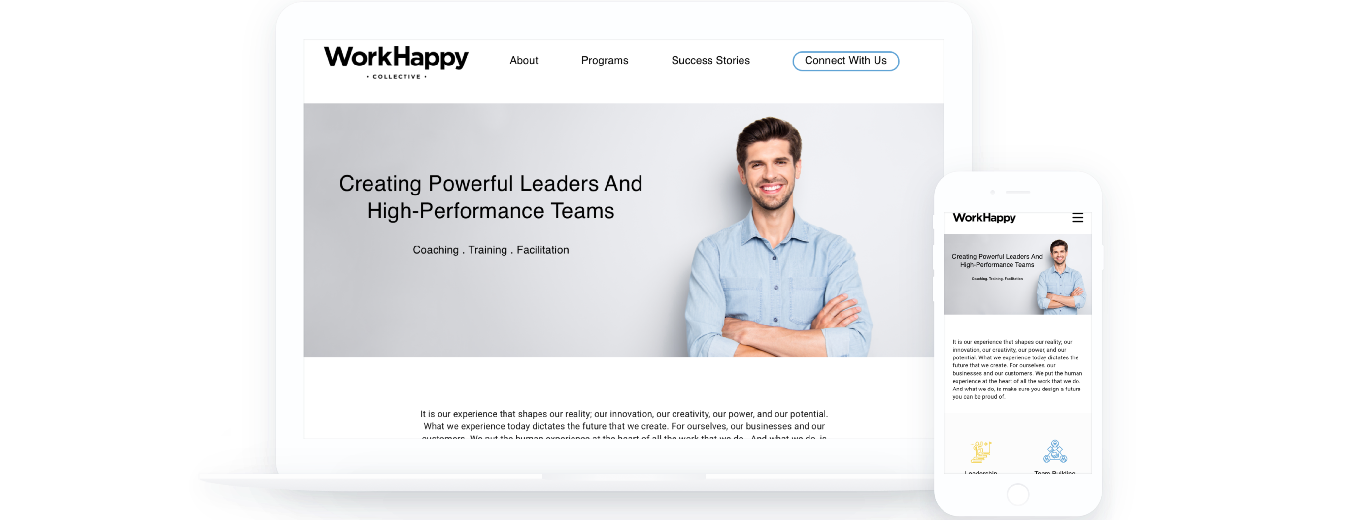
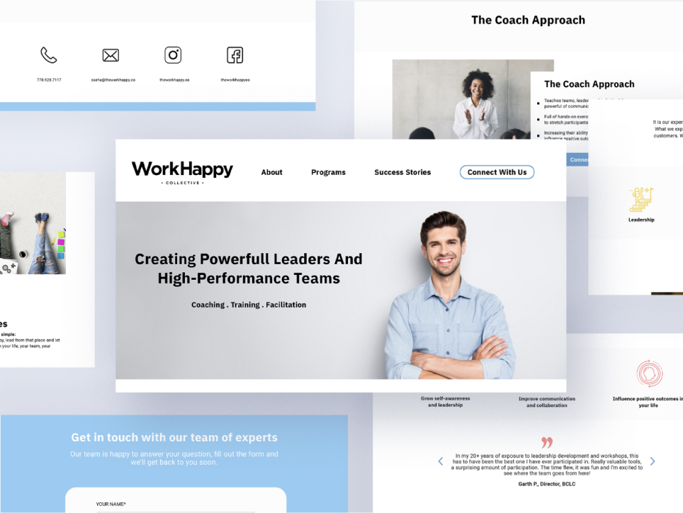
Responsive redesign for a leadership development training and coaching website
THE CLIENT
The Work Happy Company is a leadership development training, coaching and facilitation organization that helps to create powerful leaders and high-performance teams.
ROLE
UX Designer
User Research, Prototyping & Testing
THE OPPOPTUNITY
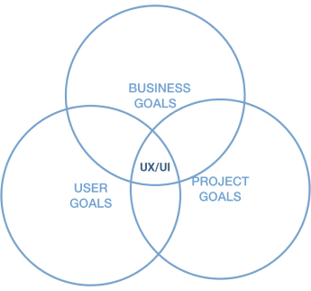
Re-brand The Work Happy and redesign the website to optimize the user experience. It will increase awareness of the positive learning process and understanding.
The project aims to merge the business, user, and project goals in our design.
TIMELINE
3 weeks
THE GOAL
Research
After we focused on redesigning the website, we next needed to better understand the wants and needs of our users.
So, for the research phase of our project, we wanted to:
- Gain an understanding of leadership development training and the coaching market.
- Research what's currently available to users in terms of coaching and facilitation.
- Identify users' motivations and pain points so we can best redesign with them in mind.
Solid UX research is the foundation of good design. Below is an overview of the domain & organizational research, competitive & comparative analysis, interviews and surveys that led us to our design decisions. Our first step in the research phase was to understand what hiring a coach is and what platforms are currently available to users in the coach hiring sphere.
We did domain research based on our first meeting with our client — Sasha.
Competitive & Comparative Analysis
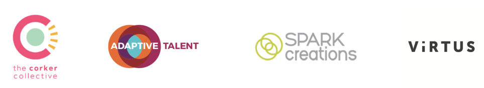
Competitive Analysis is a method to compare the functions and features of the current Work Happy Company's website to other competitors' websites. We also added another coaching website called Tony Robbins, which is a worldwide coaching company.
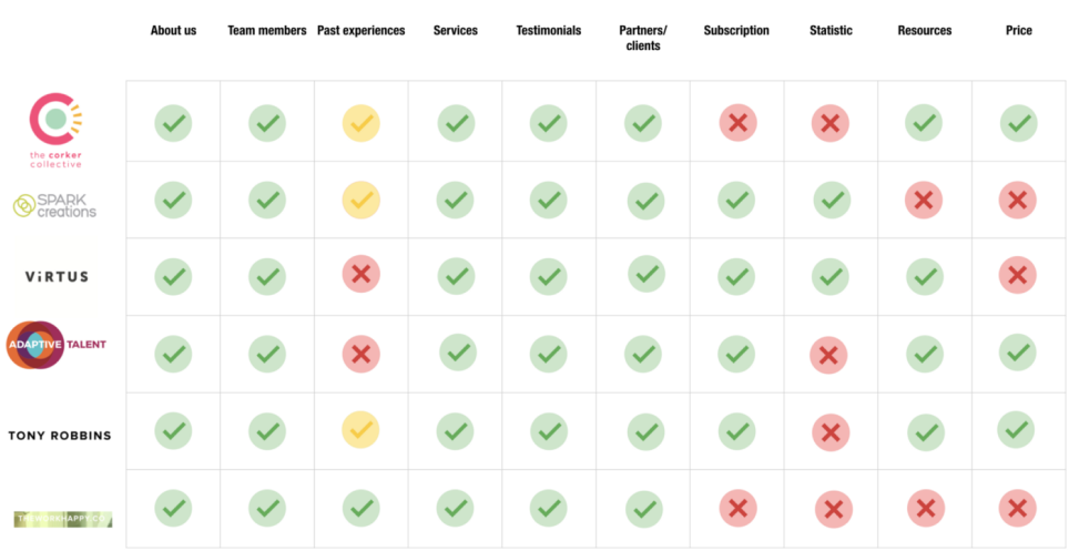
- All of these companies we compare have an About us page, Team members' page, Services page, Testimonials section and Previous clients logo section.
- Past experiences — also called photo Gallery on the current Work Happy website- are briefly mentioned by the Corker collective & Spark creations & Tony Robbins; there's no section for past experiences for Virtue and Adaptive Talent websites.
- Most websites have Resources and Subscriptions.
- And Statistics are seen on Virtue and Spark creations.
- The price, three companies have a starting price under the program description — while the others have no information about it.
This information added insight for our testing phase.
Interview Findings
We conducted five interviews (4 people that Sasha provided; and Angela — a coach at Red Academy). We asked our interviewees questions like:
- What do you value most about coaching sessions?
- What could be improved about a coach's hiring experience?
- What qualities do you look for when hiring a coach for yourself/your organization?
Here are some insightful, direct quotes.
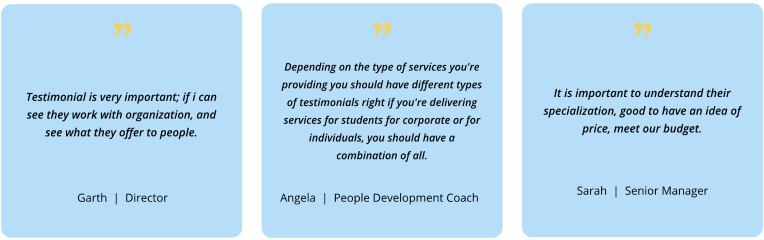
Most people we interviewed said testimonials and a sense of price are essential.
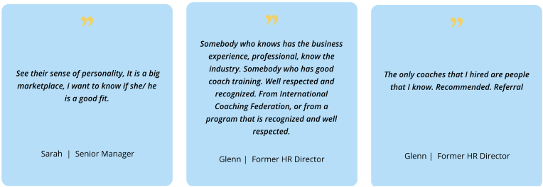
Other insights we gained are personality and credibility of the coach are the top priorities for people to consider.
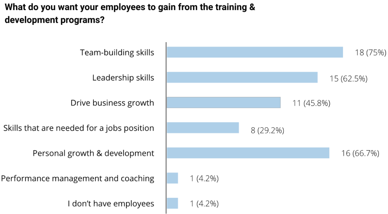
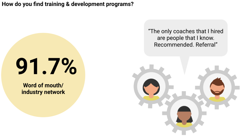
Survey Findings
To round out the data we received from our user interviews and to find out who our audience is, what they are looking for in hiring a coach and what’s important to them to make a decision, we deployed a survey across various social media platforms, receiving a total of 24 responses.
Here are some of the relevant survey results: Ranking highest on what people want to gain from the training & development programs were team-building skills and personal growth & development.
Another key finding is that 91.7% find their coaches through referral, while only 29% search online (google).
- Users are not likely to search online randomly.
- Users who look at the website usually already know who the coach is.
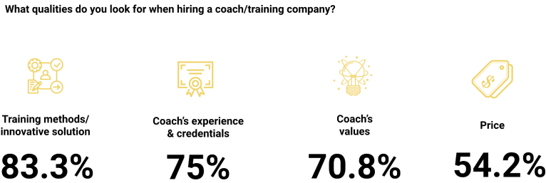
When hiring a coach, these are the top qualities that people consider: training method, coach’s experience, coach’s values and price.
In our survey, we also asked people to rate the importance of the following features on the coaching company’s website.
- Testimonials are rated as the most important for a website’s content
- 2nd is the coach’s credentials & experience
- 3rd is price. Knowing if the coach’s rate would fit the budget might be good.
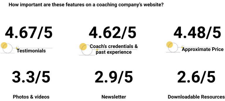
With this information, we knew what to highlight as the selling features. These results helped us prioritize which features to include.
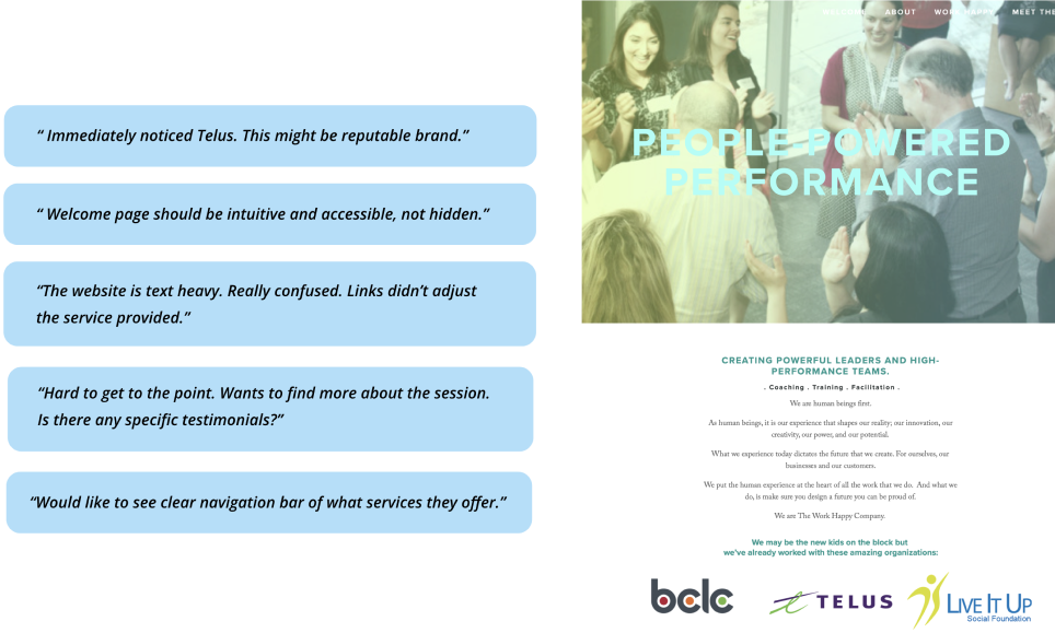
Usability testing (current website)
The final phase of our UX research was to determine its strengths and weaknesses to create a more user-centric design. Before the planning phase, we conducted usability testing on the current website.
These are some key findings that people say when they are browsing the current website:
- The user thinks the logo of Telus and other previous clients adds a sense of credibility;
- The user generally felt confused about the navigation. They couldn’t access the information easily;
These are all excellent feedbacks for us to consider.
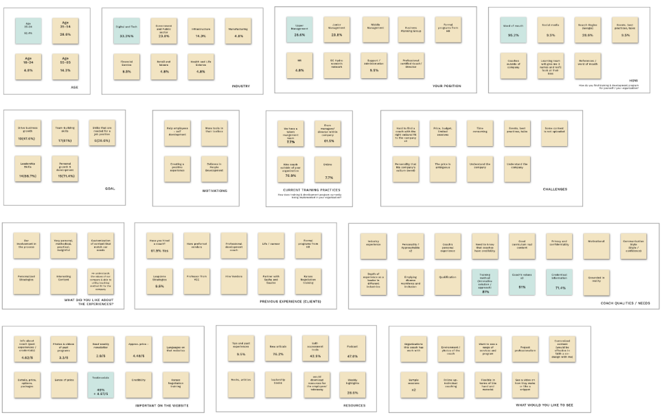
Affinity Diagram
We collected the data from our research, sorted them and created an affinity diagram.
We organized the most relevant findings from our research in an affinity diagram by grouping each item based on their relationship (such as age, industry, positive experience, challenges, etc.). It ultimately determined how much value certain aspects and features held from user research.
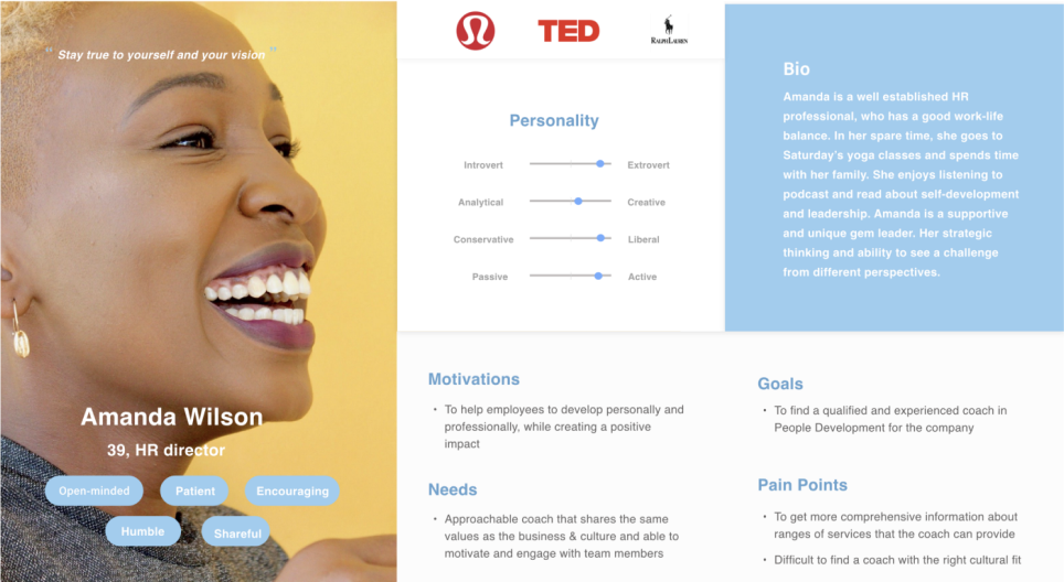
Persona
Based on all the information we gathered, we created this persona for The Work Happy Company named Amanda. Amanda’s in her late 30s, an HR professional with a healthy work-life balance. She enjoys listening to podcasts and learning about self-development/leadership. She’s someone who enjoys helping employees to develop personally & professionally to create a positive impact in people’s lives.
Our persona clearly shows the users’ motivations and expectations and how they will likely use the website.
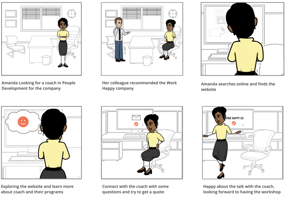
Storyboard & User Scenario
We created a storyboard where we illustrate an ideal scenario when Amanda is looking for a coach to understand her current motivations and experience connected to her particular problem.
Amanda Wilson is an HR director at a tech company. Their company values people’s development. They believe that in building business success, it is essential to train positive team experience. As an HR director, she organizes an annual training event. She asked her colleagues which coaching company has credibility and good curriculums and found Workhappyco.
Customer Journey Map
Our storyboard brings us to a customer journey where we capture the mood changes and problems of each action the user takes. We created a visual representation of the journey that customer has while experiencing hiring a coach.
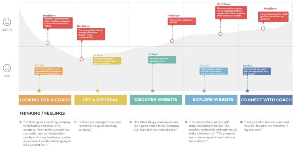
- Amanda is looking for a coach — she wants a referral from a reliable source. She asked her colleagues and others from the industry. Problem — many references and don’t know who’s the right fit
- Amanda’s colleague recommended The Work Happy Company. Problem — needs more information.
- She went online and found the website. Problem: it took some time to find the website.
- She went onto the website — the website looks clean, has relevant information, and has most of the information she is looking for, such as training methods, coach’s credentials/experiences, companies that this coach has worked with/testimonials, and some information about the programs. Problem — I don’t know if the programs fit the company’s budget.
- There is easy access to contact the coach — find a form she can fill out to inform the coach of her needs efficiently. Problem — not sure when she will get the response.
Feature Prioritization
We prioritize our feature list to determine the minimum viable product (MVP). During the research phase, we collected data to find out what’s important for people to look at and their top priorities when they are looking for a coach online.
The list was created according to research interviews and survey results, considering our users’ needs and features that would be necessary for the app to function effectively.
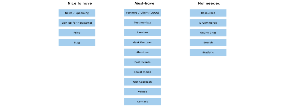
After we’ve figured out the must-haves, nice-to-haves, and not needed, we’ve focused on the must-haves.
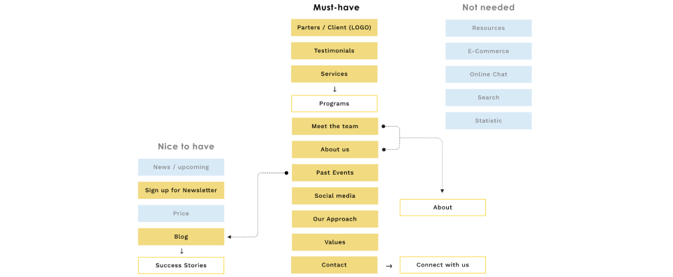
In this project, when we created our MVP, we included Services (Programs), Meet the team, About Us (About) and Contact Us (Connect With Us).
We also included some Nice to Haves: Blog in Success stories (Past Events), Newsletter in Subscribe.
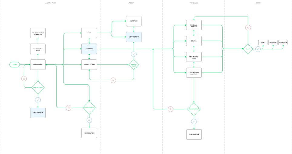
User Flow
After we created our Persona and Story Board, we worked on our user flow.
It is the complete user flow of how Amanda would navigate through the website. It helped us to detect all possible actions by the user. The first part consists of the landing page portion. The second part shows Amanda’s experience branches out once they arrive on the landing page.
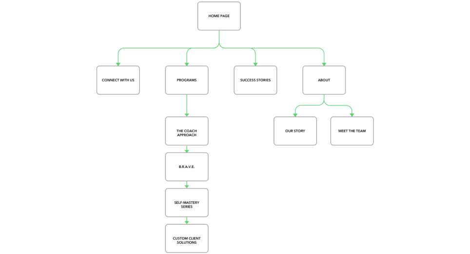
Site Map
It brings us to create the site map of the website. The navigation lets users learn more about The Work Happy Company and its programs.
Use Case
The use case below shows all the iterations the user goes through to book a session.
Use Case: Connecting with a coach
Precondition: The homepage has a navigation bar with a list of Programs.
The homepage has a navigation bar with a "Connect with me" button. The course description page has a "Connect with me" button.
- The user clicks on the program.
- The user sees a list of programs.
- The user selects a program.
- The user sees information about the selected program.
- The user clicks the "Connect with me" button.
- The user sees the "Connect with me" form.
- The user fills up the "Connect with me" form.
- The user clicks the "Connect" button.
- The system shows a confirmation message.
Design
Upon completing the project's research and planning stages, we sketched out the designs on paper.
Prototyping
We each drew our home page versions and compared them to develop the best solution. The main differences between our designs were the placement of the Our Coaches and Testimonials sections on the landing page.
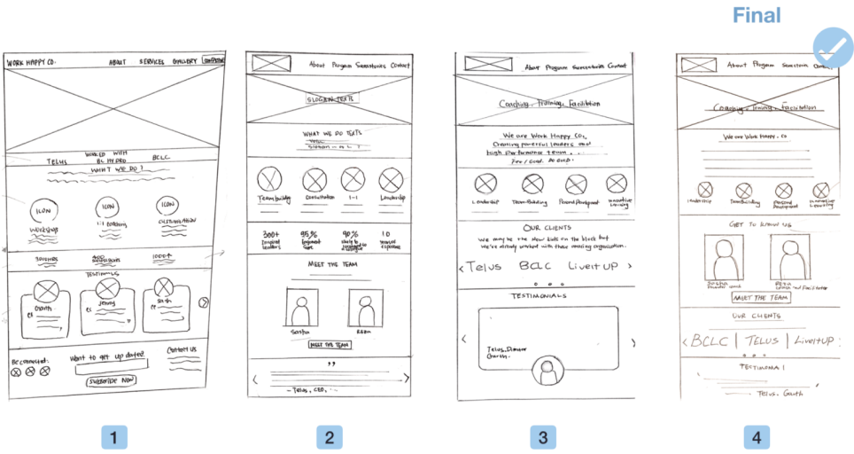
We structured the information on the page and made it easier to read.
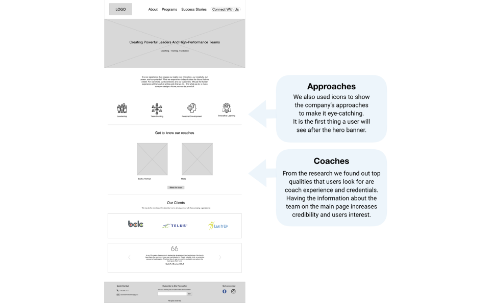
- We also used icons to show the company's approaches to make it eye-catching. It is the first thing a user will see after the hero banner.
- From the research, we found out the top qualities that users look for are coach experience and credentials. The information about the team on the main page increases credibility and user interest.
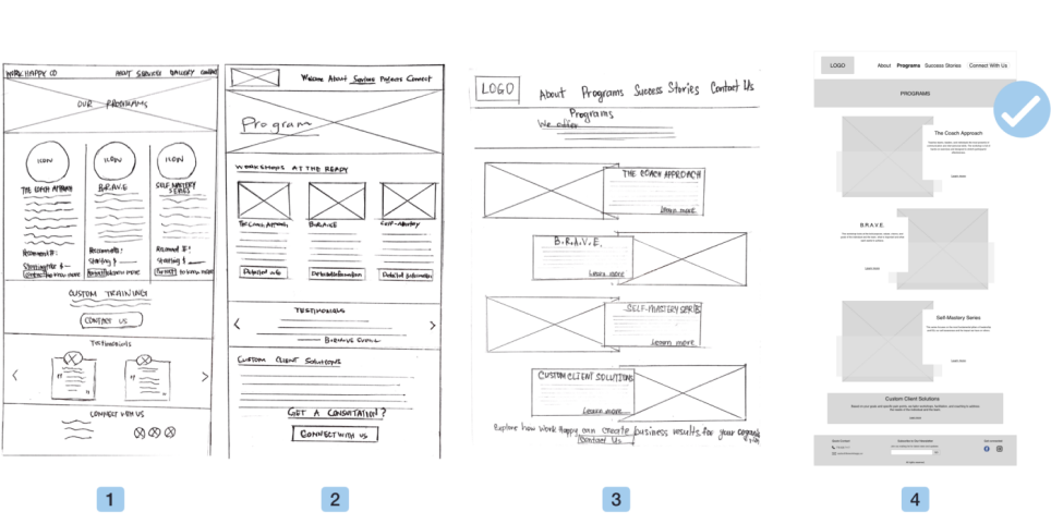
Besides, we each drew our version of the Program page and compared them to develop the best solution. The main takeaway from the sketches was the placement of the Testimonials section and Program details as Price arranged, which we didn't include as Sasha — our client preferred not to show program prices on the website.
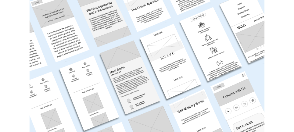
We began designing our mid-fidelity prototypes for the web and mobile.
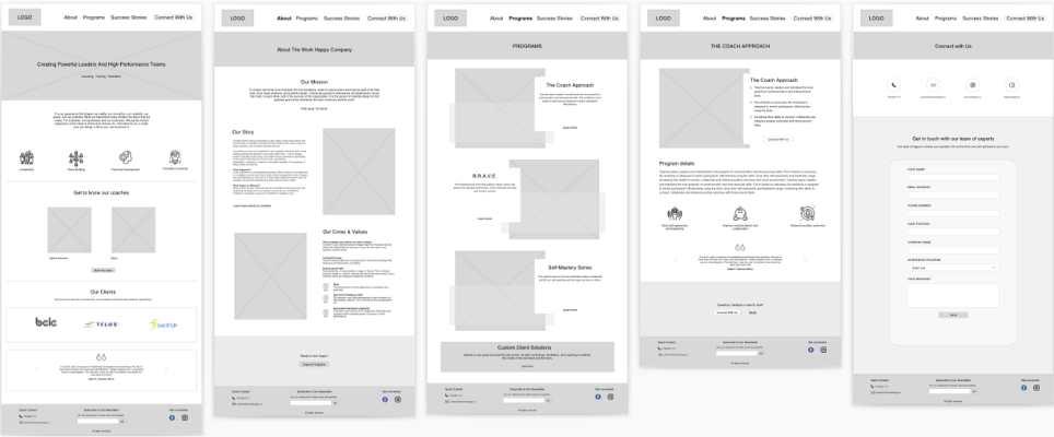
These prototypes are a more concrete representation of our ideas and represent the changes we made from our usability testing.
Test
To refine the existing features and further assess the user's needs, we put the paper prototype through user testing.
Usability Testing
Booking a coaching session.
You are looking for a coaching session for personal development. Use the website to book a session with the coach.
-
Learn about the company and the coaches
-
Send an inquiry about a workshop
-
Learn about past events
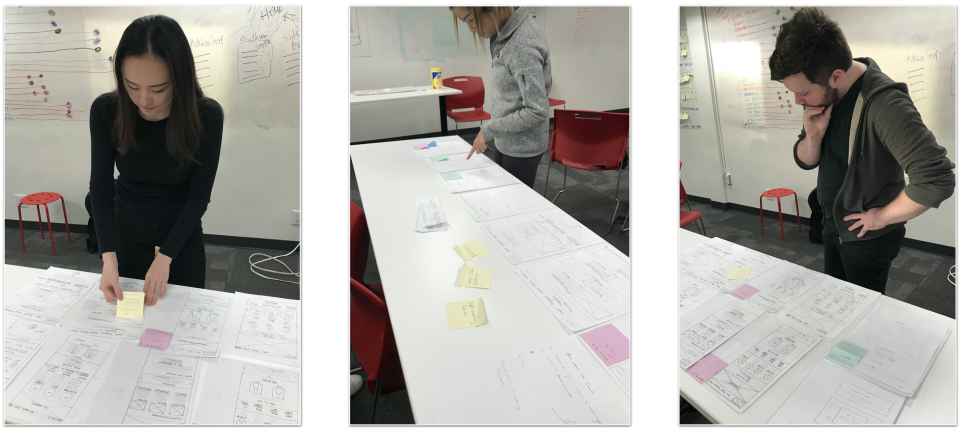
Usability tests presented valuable insights on how to improve the prototype:
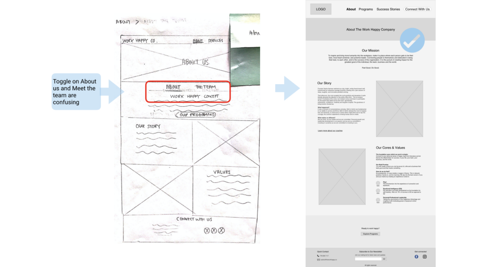
- Toggle on About Us and Meet the Team are confusing and not consistent with the Program page;
- The success stories page is confusing — is it a dead-end, or is there an action;
- Too many buttons (CTA) — consider a hyperlink for a secondary button;
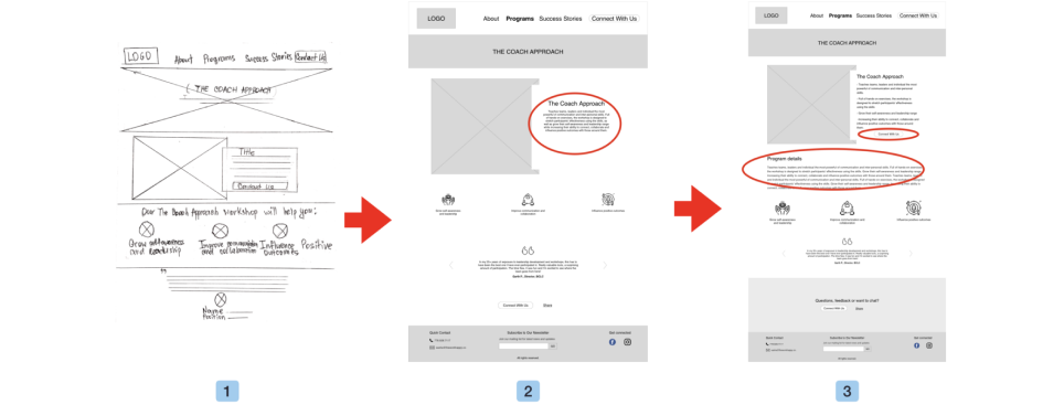
Learnings in prototype testing showed that users found reading the text on the Program page difficult, so we decided to structure the information into bullet points and add the Program Description and "Connect with Us" button below.
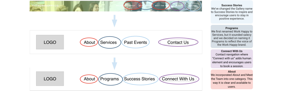
Another takeaway from the user testing was regarding the navigation bar. It was modified to achieve MVP and indicate hierarchy.
- We've changed the Gallery name to Success Stories to inspire and encourage users to stay in a positive experience.
- We first renamed Work Happy to Services, but it sounded sale, and we decided to name it Programs to reflect the voice of the Work Happy brand.
- Same with the Contact navigation where "Connect with us" adds a human element and encourages users to book a session.
- We incorporated About and Meet The Team into one category. This way, it is transparent and available to users.
These improvements were also reflected in our mobile designs and improved the hierarchy of the website.
After testing, prototypes are then passed on to the UI team to stylize the final look and feel of the website.
Creative planning
Our UI team created a mood board, which visually depicts the look and feel our client wanted to convey. The mood board is shown below, along with the mood words our UI team wanted to be associated with the experience of hiring a People Development Coach.

UI team wanted to take the mission statement of Work Happy Company and create an image and design that promoted Sasha's why focused on creating a platform where the user felt uplifted and excited about the services Sasha and her team provide.
The main themes focused on keeping the colour palette, typeface, logo, and imagery severe but playful, polished, sleek and containing a clear purpose while maximizing negative/white space.
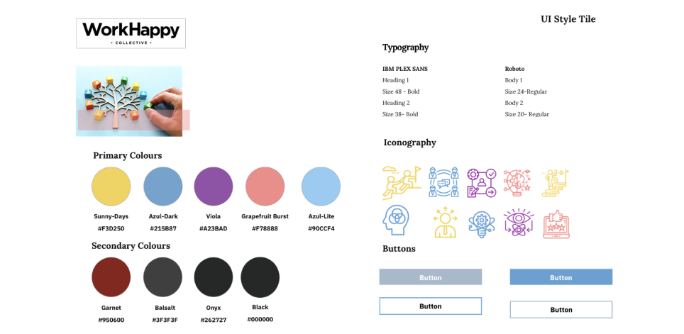
Icons maintained consistency within the colours. They have opened up negative space with the icons making them feel like the design has more room. The design approach had a singular colour for the button, consistent throughout the entire design. The new logo created by the UI team was simple, easy to read and understand and efficiently communicates a message.
Future Consideration
For our future consideration,
If we have more time, we would love to explore the idea of implementing a Resources section in our design. It would make the user experience more engaging.
Features such as E-Commerce/Appointment Scheduling would be fantastic features to have.
Our research results show that the Price is one of the high-rated features that users want to see on the website.
Another consideration is The Work Happy workshop photos taken by a professional photographer to better showcase the Work Happy Company's value.
Conclusion
Overall, it was a good experience when my team and I were redesigning the website.
The project's goal was to redesign the website by optimizing the user experience and attracting new partners looking for qualified and experienced coaches for an organization.
Every design decision was made with the goal in mind. By implementing user research, our team determined the most critical elements of their business, such as the coach's credentials, testimonials, and programs. According to user testing, these elements were highlighted and placed strategically in the design process.
Here are some key points from the retrospective meeting with my team.
What should we keep doing?
Teammates inspire one another.
Listening to your team (each other's opinion).
Making collaborative decisions.
Creating a good UX Library eases collaborative work within the UX/UI team.
What should we start doing?
Taking risks.
What should we stop doing?
Focusing on the project, not on the client. In other words, work with the client.
Action item
Encourage the client to be actively engaged in the design or research process.
Schedule meetings with the client on the Designing and Testing stages to confirm the design decisions.